How do I access the activity summary pie charts (i.e. graphs) on the Neoserra home page?
Neoserra offers a variety of different ways of looking at your data. In fact, there are four different views for most interfaces. Looking at the main Neoserra desktop you can access the four views as shown below:
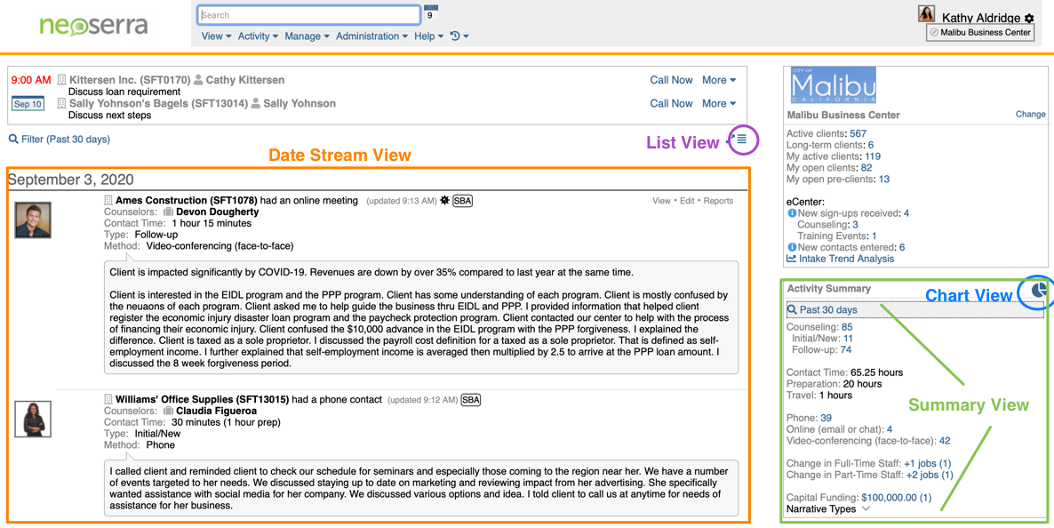
All four views will show the data based upon the filter applied. In this FAQ we will discuss:
- Filtering your views
- Data Stream
- Activity Summary
- Chart View
- List View
- Accessing the Data Stream, Summary and Chart Views from Activity Summary
Filtering your views
You can search your data by using the filter found at the top of the Data Stream:

You can search by date range, or you can search for data within one center or activity conducted by a particular counselor:
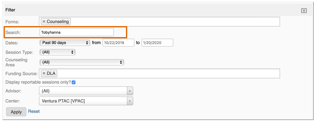
Furthermore, you can limit the search to certain data entry forms. The data selected in the filter determine what is shown in the data stream, in the activity summary, on the graphs and in the list view. In other words, the filter controls all the views on the home page.
Data Stream
The primary view is the data stream view. The data stream view provides a detailed overview of all the activity that has occurred during the period specified by the filter. The data stream view can optionally be enhanced with a picture of each counselor. The information shown on the data stream is listed chronologically with the most recent activity at the top. In addition to using the filter to set your date parameters, you can also use the filter to decide which center and/or counselor should be included in your view; which funding sources should be included in you view; and whether you want to include non-reportable data along with the reportable data.
Activity Summary
Alongside the data stream view, you will always see the Activity Summary view in the right-hand panel. This view is available, by default, on the main home page of Neoserra and also on each client, contact, counselor and center record. In fact, the summary view is always available when the data stream is also showing. The Summary View provides a quick overview of your activity specified in the filter. Changing the filter will instantly update the Activity Summary view.
Some data may be compressed in the Activity Summary view for brevity, but clicking on the drop down arrow exposes the rest of the information:
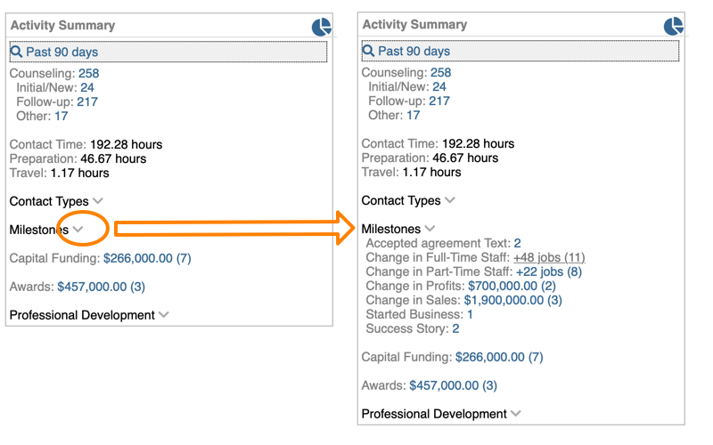
Chart View
The chart view provides a wonderful visual way of looking at the same data in a graphical format. Simply click on the icon circled in blue above, and the following screen will appear:
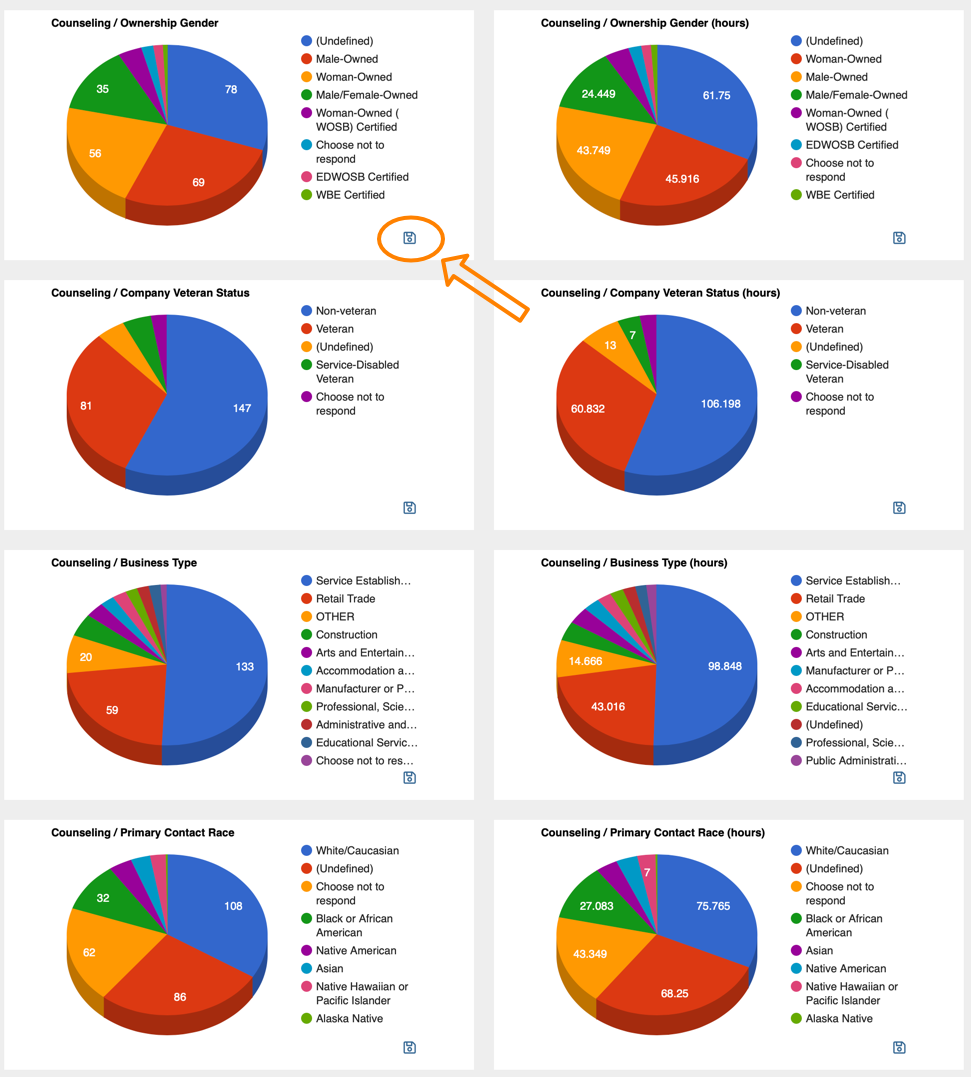
The graphs will reflect the information represented in the filter. In other words, if your filter is looking at data from the last 90 days, then the charts will reflect that same data broken out in the chart format.
Changing the filter will immediately update the graphs. Each chart includes the top ten selections, with an "OTHER" category to capture the rest. Sometimes the "OTHER" category can have a bigger slice of the pie than one or more of the top ten selections because the "OTHER" slice represents the sum of the remnants and sometimes the sum of the leftover-bits is more than one of the larger categories.
Each slice of the pie can be clicked upon to see specifically those entries that make up the slice.
The graphs can be exported individually using the download icon highlighted with the orange arrow above. To export the raw data you can use the List View as described below.
List View
The fourth way to view your data is the list view. This view may be of particular interest on a single client record because it offers a nice alternative between both the verbose data stream view and the abbreviated summary view. You can click on the list view icon right above the data stream on the right-hand side as highlighted in the first graphic in purple. The list view looks as follows:

The list view essentially provides a condensed version of the data stream.
Exporting Data
Follow these steps if you want to export some of the data elements found in the Activity Summary:
- Click on the number in the activity summary window that represents the data that you want to export.
- By default, the data will be shown in the data stream view, click the "List View" icon to see the information list view.
- Use the Filter|Select Columns option to include the data elements you want to export.
- Once the screen represents the data you want to export to Excel, click Reports|Quick Report and choose the CSV (Export) output format.
- From here you can copy and paste the information into Excel.
Accessing the Data Stream, Summary and Chart Views from Activity Summary
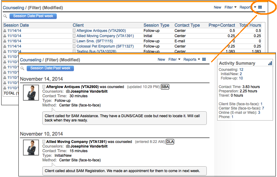
The various activity records in Neoserra found under the "Activity" menu are presented, by default, in a list view. However, by clicking on the data stream icon in the upper right-hand corner, allows you to look at your activity records in a data stream view:
Want more? Browse our extensive list of Neoserra FAQs.
